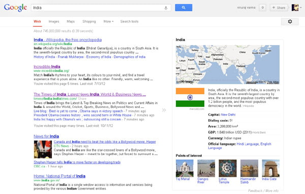
Google unveiled a completely new simpler, cleaner design for search results page. Some months ago we reported about a limited field test run by Google, a new navigation user interface on search result page. Google has now made this new redesign official.
According to Google, they have been working on ways to create a consistent search experience across the wide variety of devices and screen sizes people use today. The design changes were started with tablets last year, got it to mobile phones a few weeks ago, and are now rolling out to the desktop.

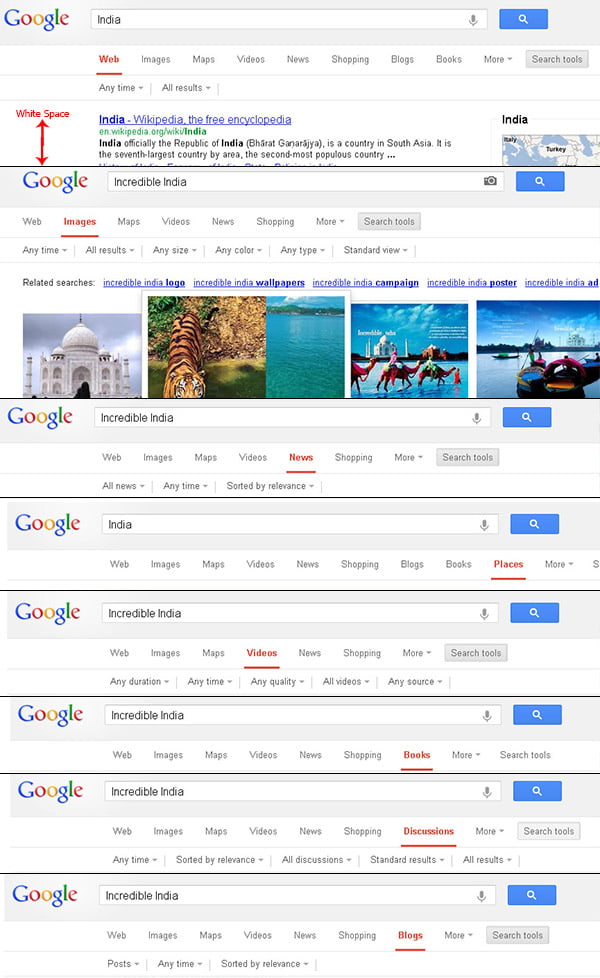
The new Google search navigation interface shown as top to down menu placed on the top of the search results, instead of the usual navigation we see on left hand side. This new navigation UI resembles that of the Bing navigation interface. With the new design, there’s a bit more breathing room, and more focus on the Knowledge Graph.
The new navigation interface involves the search navigation, search options and all filters between the search bar and search results. With this interface it seems extra white space added on the left side.

The new redesigned search result page is going out to Google.com users in the U.S and to users in other languages and regions within next few months.


