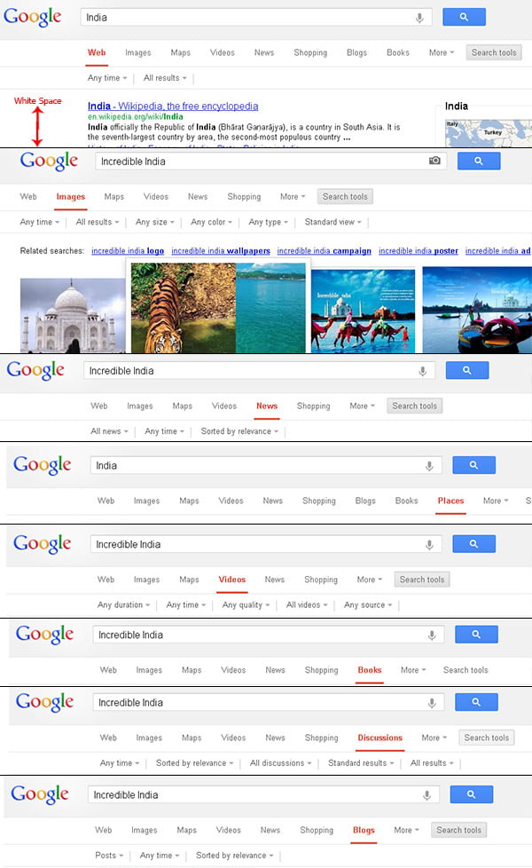
If you are using Google search too much a day, you may get lucky and get involved in some of the limited test Google do with the search page. Today we were lucky and got hold of the new navigation user interface Google was testing around. I noticed this new navigation UI while browsing Google on Chrome in incognito mode, couldn’t replicate it while signed into Google account and on other browsers.
The new Google search navigation interface shown as top to down menu placed on the top of the search results, instead of the usual navigation we see on left hand side. This new navigation UI resembles that of the Bing navigation interface.

The new navigation interface Google testing involves the search navigation, search options and all filters between the search bar and search results. With this interface it seems extra white space added on the left side, just like the current Bing layout. We have taken some screenshot of the new interface, just have a look around –

Note that this changes from Google is reflected to a very few users and there is 99% chance that this new look and feel never get released to the public. How do you like the new design from Google, do share your comments.


