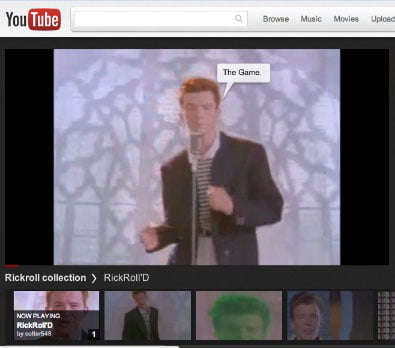
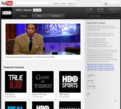
Youtube, worlds largest video source run by search engine giant Google is currently testing out super cool new user interface codenamed Cosmic Panda through its ideas incubator, TestTube. The new UI ( user interface ) features changes in the Videos, Video player, Playlists, & Channels. The Cosmic Panda was announced on Tuesday on Youtube blog, which provide fully redesigned YouTube.

According to one of the statements from Youtube Blog
“We are always testing new things on YouTube with the goal of improving the site’s overall experience, We encourage all users to opt in to this experiment and tell us what they think about it.”
Google’s video service YouTube seems to be pushing really cool new updates to enhance the overall experience of the users. It seems Google is preparing for totally new UI for all its products like for Google+, Top navigation bar, Gmail change etc.
Video and Video Player change :
The test UI bring a new interface for the flash player component and it have new buttons like Comments, Suggest video and Video size changer completely featured within the player itself. Clicking on comment button brings out the list of comments just below the video, the suggestion button will reveal new UI with large list of suggested videos. The Video size panel helps to change the quality of the video on the player and to choose a different viewing area other than the default.
Playlist :
The new playlist UI seems to be very similar to the old one ( except the dark theme it has). The player now allows the video size change. But it seems now it removed the shuffle feature in the playlist.
YouTube Channel :
The Cosmic Panda test UI has fully reworked the channels we have on YouTube. Now the channels comes with some cool graphics, featuring the channel logo, video and below that featured playlist or other videos. There now seems to be only three buttons, Featured, Video and Community ( that seems to be way good 🙂 )
This new interface is currently is test mode so users have to opt for it here – Youtube Cosmic Panda .Try it and provide your valuable feedback or suggestion from improvement.
Do comment on what you feel about this new User Interface?


