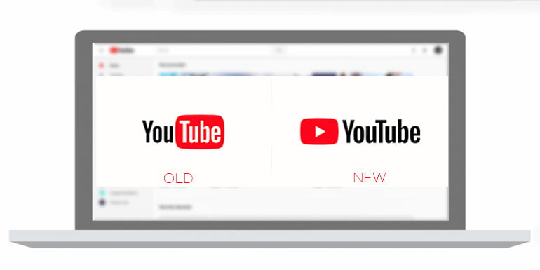
YouTube has been evolving since they launched back in 2005. Now after 12 years, in 2017, they are adding a bunch of new features including refreshed logo and material design. During these years, they have influenced every walk of life from education to entertainment, making the world smaller and better. They also introduced services and apps specifically tailored for its category of viewers and creators. These include YouTube Music, Gaming, TV, Kids and Red membership. Let’s take a look at the new logo, app features and material design.
Refreshed YouTube Logo
YouTube has redesigned their logo to suit the multi-screen world. The new logo is a combination of the cleaned up version of the YouTube wordmark and Icon. When room is limited (say on a smartphone), the brightened up Icon acts as an abbreviated Logo. This is the first time YouTube makes a change in its logo since 2005.

YouTube Mobile App Features
The main mobile app is getting a lot of enhancements including the logo update. They have made the header white, to let contents take the focus and moved the navigation tabs to bottom for better thumb reach. They have also added a library and accounts tab to give you an easy access to what you’re looking for.
In addition to existing double tap on videos gesture feature, they are bringing a new swipe gesture on videos. While the existing feature lets you fast forward or rewind 10 seconds the same video, the new feature lets you jump between previous and next videos. The playback speed can now be altered in the mobile app also, which was possible only on the desktop.
The player will now change the shape to match the video format you’re watching, such as vertical, square or horizontal. So better viewing experience and no more black bars for vertical videos. While on full screen, swipe up to see a new row of suggested videos. The area below the player will also be getting some modifications, to change the way you browse contents. Recently they also added a new way of sharing videos with chat feature.
- New design, white header, navigation tab position, library and account tabs.
- Adding swipe to jump between previous and next videos.
- Playback speed can now be changed in the app.
- Player will change shape to match the video, no more black bars.
- A new row of suggestions and browse feature.
Desktop Design
Starting today, the Material design of YouTube will be available to its users globally. They have been working on this design for the past few months and have received enough positive feedback to make this live. This will deliver a fresh, simple and intuitive user experience and gives focus on contents. In addition, there is the Dark Theme desktop design, which turns the background dark giving you a cinematic experience.
How To Get Them All
If your account isn’t updated yet with the new design, you can activate it manually. For the app features, you may need to update the YouTube app.
- Visit [YouTube.com/New], Click get it now.
- Download or Update mobile app [Playstore.com/YouTube]
To sum up, YouTube is still evolving to get better. Their mission is, to give people a voice and show them the world, no matter what device they use. In the recent times, they released YouTube Go app for Indian users, which reduces data usage for downloading or streaming videos with added sharing feature. Moreover, the smart offline feature, lets you utilize night data packs efficiently. So hurry up, update and check out these new features and there is more up their sleeve. Hope you enjoyed the write-up, Peace!


