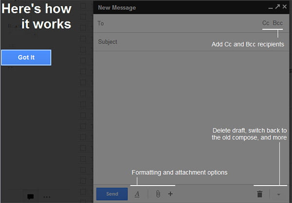
For those who spend lots of time on email for their professional and personal needs can now save some time while composing and replying to email with a new feature on Gmail. In an effort to make Gmail more faster and easier to use, Google introduced a completely redesigned compose and reply experience.

Mails unlike instant chats, are something you spend lots of time in composing. You tend to check your old mails, chat history for reference, thus saving a draft, opening the old email, and then reopening your draft again wastes valuable minutes. Google thus redesigned the whole compose process making it just like chats, which pops in a windows. Thus making it easy to reference any other emails without ever having to close your draft. Users can even do a search or keep track of new mail as it comes in. And because the compose window works the same way as chats, users can write multiple email at once and minimize a message to finish it later.
Another feature that comes with the new compose design is the way recipients contacts look and added to email. From now on you can see profile pictures of your contacts in autocomplete helping you find the right person faster. It have a option to drag and drop the new email address between to:, cc: and bcc:. After addition of recipients the address area collapses automatically to make room for your compose area.
Gmail team at offical Gmail blog commented “The new compose is designed to let you focus on what’s important: your message. The controls are still there when you need them but get out of the way when you don’t. We’ve even added some new features like the ability to easily insert inline images and have more to come.“
Similar changes is being added to the Reply section too. The reply experience has been designed to fit better inline as part of users conversation, replies take up much less vertical height, intelligently expand to fit the content, and always keep the recipients and other controls in view no matter how long user message gets.


