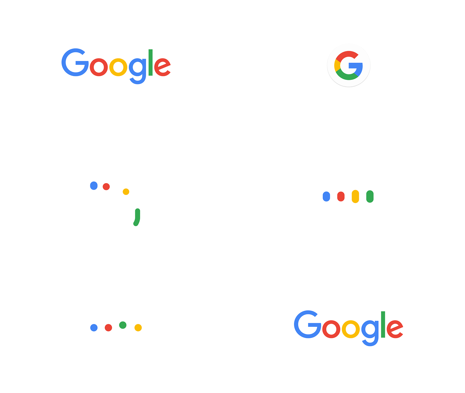
Google = simple, uncluttered, colorful, friendly, fun and more. Within a month after the big announcement of its new parent company Alphabet, Google has now unveiled a new logo. The new logo focuses on its presence on seamless computing across an endless number of devices and different kinds of inputs.
“Today we’re introducing a new logo and identity family that reflects this reality and shows you when the Google magic is working for you, even on the tiniest screens. As you’ll see, we’ve taken the Google logo and branding, which were originally built for a single desktop browser page, and updated them for a world of seamless computing across an endless number of devices and different kinds of inputs (such as tap, type and talk).” said Tamar Yehoshua, VP, Product Management & Bobby Nath, Director of User Experience on Google official blog.

“It doesn’t simply tell you that you’re using Google, but also shows you how Google is working for you. For example, new elements like a colorful Google mic help you identify and interact with Google whether you’re talking, tapping or typing. Meanwhile, we’re bidding adieu to the little blue “g” icon and replacing it with a four-color “G” that matches the logo.” continued Tamar Yehoshua.
On a designer point of view, the new logo got an updated typeface. They have now used more light Sans-Serif typeface in place of the Serif font. It’s actually a custom typeface called Product Sans, which also being used in the branding of its parent company Alphabet. This typeface offers more legibility even on tiny screens than the more ornamental serif lettering. And for more tiny space Google will be using the new “G” logo, that rendered in the four colors of the full new Google logo.
And what changed in this 17 years? here take a look –


