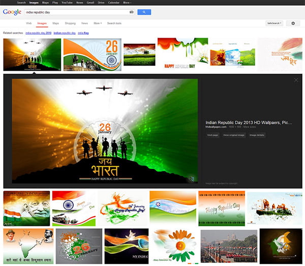
Google started rolling out a brand new user interface for its Image search (images.google.com) on desktop which provide a better search experience. The new redesigned layout is based on extensive feedback from both users and webmasters. In the new Google image search, results are displayed in an inline panel similar to that of current tablet search layout so it’s faster, more beautiful, and more reliable.

Google now display detailed information about the image (the metadata) right underneath the image in the search results, instead of redirecting users to a separate landing page. The inline image view displays some key information on images such as the title of the page hosting the image, the domain name it comes from, and the image size on a much more prominently next to the image. Some other features include –
- In the details page, the domain name is now clickable, and there a separate button to visit the page the image is hosted on. This click -able links adds extra benefit for webmasters as there are now four clickable targets to the source page instead of just two, which means increase in the average click-through rate to the hosting website.
- Another change brought is the source page will no longer load up in an iframe in the background of the image detail view. This speeds up the experience for users, reduces the load on the source website’s servers, and improves the accuracy of webmaster metrics such as pageviews.
- For webmasters the image search query data is still available in Top Search Queries in Webmaster Tools.
Have you tried the new Google image search? Tell us your experience using it.


