Spending hours and hours on Photoshop or other photo editing application to achieve some extra effects on your images like adjusting the brightness and contrast or adding up a blur or grayscale effect. If you are looking to use them on your website or blog then there is another way to do that simple and easy with CSS Filters effect.
One single line of code will make your images standout of the crowd adding some cool effects without effecting the original image at all. But one negative side to it is that the CSS filters will only work on Webkit based browser mainly on Chrome, Safari etc. If you are ok with that let’s get started and add some effects to your image –
To start let’s apply the Grayscale effect to one of my images, add up this CSS to your image tag –
img {
-webkit-filter: grayscale(100%);
}
You can increase or decrease the effect by simply changing the percentage value from 0% to 100%.

Next the famous Sepia effect which gives the image a reddish-brown color tone. Here also you can change the percentage value from 0% to 100%.
img {
-webkit-filter: sepia(100%);
}
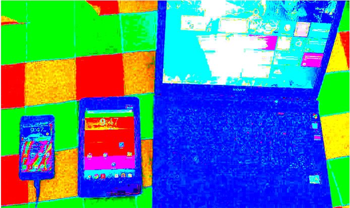
Next the Saturate effect on your image, adding a value of 0% makes the image completely un-saturated and adding a value of 100% leaves the image unchanged. Try adding the values in between them to get an overly of bright colors.
img {
-webkit-filter: saturate (20%);
}
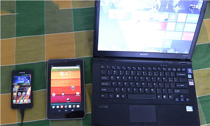
Next for adding extra Brightness to the image, this will make the image more or less bright. A value of 0% will create an image that is completely black and a value of 100% leaves the image as original unchanged.
img {
-webkit-filter: brightness (70%);
}
Again let’s add some extra Contrast to the image. Adding 0% makes the image completely grey and 100% leaves the images unchanged, but you can have the value over 100% creating some extra effects on your image.
img {
-webkit-filter: contrast(150%) ;
}
You can also add Gaussian Blur effect to the images. Note that the blur values are stated in pixel radius similar to what you find on Photoshop.
img {
-webkit-filter: blur(10px) ;
}
Another interesting one is the Invert effect on images, a value of 100% makes the image completely inverted and 0% leaves the image untouched.
img {
-webkit-filter: invert(50%) ;
}
Interestingly you can also combine two effects to build some cool images, like combining both Brightness and Contrast or adding the grayscale and contrast to the images.
-webkit-filter: brightness(50%) contrast(150%);
}

img {
-webkit-filter: grayscale(60%) contrast(180%);
}
Also instead of applying the effects directly to the images you can add them during mouse hover (img:hover), making it more appropriate and effective.
Do try this out and if you want to learn more about the CSS filter head over to World Wide Web Consortium (W3C).


